Predicting Sales for Fictitious Learning Modules Using Time Series Analysis
A Kaggle Project
In this blog post, I will walk you through my recent Kaggle project submission where I tackled the challenge of predicting a full year's worth of sales for various fictitious learning modules in different countries. The dataset is synthetic but contains many real-world data effects, such as weekend and holiday effects, seasonality, and more. My task was to predict sales during the year 2022. So let's get started!
You can find the dataset used by clicking this link and creating a new notebook, which has the dataset on the right sidebar.
Understanding the dataset
The dataset consisted of two main files: train.csv containing the sales data for each date-country-store-item combination and test.csv, where I needed to predict the corresponding item sales. Additionally, there was a sample_submission.csv file provided in the correct format as a reference. So let's explore the train.csv
import numpy as np
import pandas as pd

df = pd.read_csv('/kaggle/input/playground-series-s3e19/train.csv', parse_dates=['date'], infer_datetime_format=True)
df['date'] = df['date'].dt.to_period('D')
df.head()
| id | date | country | store | product | num_sold | |
| 0 | 0 | 2017-01-01 | Argentina | Kaggle Learn | Using LLMs to Improve Your Coding | 63 |
| 1 | 1 | 2017-01-01 | Argentina | Kaggle Learn | Using LLMs to Train More LLMs | 66 |
| 2 | 2 | 2017-01-01 | Argentina | Kaggle Learn | Using LLMs to Win Friends and Influence People | 9 |
| 3 | 3 | 2017-01-01 | Argentina | Kaggle Learn | Using LLMs to Win More Kaggle Competitions | 59 |
| 4 | 4 | 2017-01-01 | Argentina | Kaggle Learn | Using LLMs to Write Better | 49 |
We have 6 columns, id, date, country, store, product and num_sold.
The id column seems to be serially numbered starting from 0 till last the last row. We parse the date column using 'parse_dates' in pd.read_csv() and convert it to a period of a day using df['date'].dt.to_period('D').
The other 3 columns, country, store and product are categorical data of type string. The most important one being num_sold which is what we will have to predict.
Exploratory Data Analysis
To have an eagle overview of the dataset, we use
df.info()
Output:
<class 'pandas.core.frame.DataFrame'>
RangeIndex: 136950 entries, 0 to 136949
Data columns (total 6 columns):
 #   Column    Non-Null Count   Dtype
---  ------    --------------   -----
 0   id        136950 non-null  int64
 1   date      136950 non-null  period[D]
 2   country   136950 non-null  object
 3   store     136950 non-null  object
 4   product   136950 non-null  object
 5   num_sold  136950 non-null  int64
dtypes: int64(2), object(3), period[D](1)
memory usage: 6.3+ MB
This shows that the dataset has 136950 rows, and no null values, which is great. The Dtype column shows the datatypes of corresponding columns.
We can find the unique values in each of these columns using:
df.nunique()
Output:
id          136950
date          1826
country          5
store            3
product          5
num_sold      1028
dtype: int64
We can see that
datehas 1826 days which means 4 years of data starting from Jan 2017 to Dec 2021.Whereas there are 5 different countries
3 different stores
5 different products
The unique price values in
num_solddoesn't give much insight.
Let's see what are these unique values
for col in ['country','store','product']:
    print(f'The unique values in {col} are: \n', df[col].unique())
    print()
Output:
The unique values in country are:
 ['Argentina' 'Canada' 'Estonia' 'Japan' 'Spain']

The unique values in store are:
 ['Kaggle Learn' 'Kaggle Store' 'Kagglazon']

The unique values in product are:
 ['Using LLMs to Improve Your Coding' 'Using LLMs to Train More LLMs'
 'Using LLMs to Win Friends and Influence People'
 'Using LLMs to Win More Kaggle Competitions' 'Using LLMs to Write Better']
On seeing a few more rows of data we can observe that we have data of every day of every country of every different store and of every different product.
This can also be shown from 5countries x 3stores x 5products x 1826dates = 136950 rows of the dataset.
If you wish to visualize this, you can do it by:
# What a day's sale looks like?
df.groupby(['date', 'country','store','product']).mean().head(60) # 5products * 3stores * 5countries * 365days * 5years = 136875rows + leap year days
| date | country | store | product | ||
| 2017-01-01 | Argentina | Kagglazon | Using LLMs to Improve Your Coding | 10.0 | 340.0 |
| Using LLMs to Train More LLMs | 11.0 | 371.0 | |||
| Using LLMs to Win Friends and Influence People | 12.0 | 53.0 | |||
| Using LLMs to Win More Kaggle Competitions | 13.0 | 364.0 | |||
| Using LLMs to Write Better | 14.0 | 285.0 | |||
| Kaggle Learn | Using LLMs to Improve Your Coding | 0.0 | 63.0 | ||
| Using LLMs to Train More LLMs | 1.0 | 66.0 | |||
| Using LLMs to Win Friends and Influence People | 2.0 | 9.0 |
Let's plot some data:
import matplotlib.pyplot as plt
import seaborn as sns

plt.figure(figsize=(10,12))
for i,col in enumerate(['country','store','product']):
    plt.subplot(2,2,i+1)
    df.groupby(col)['num_sold'].mean().plot.bar()
Output:
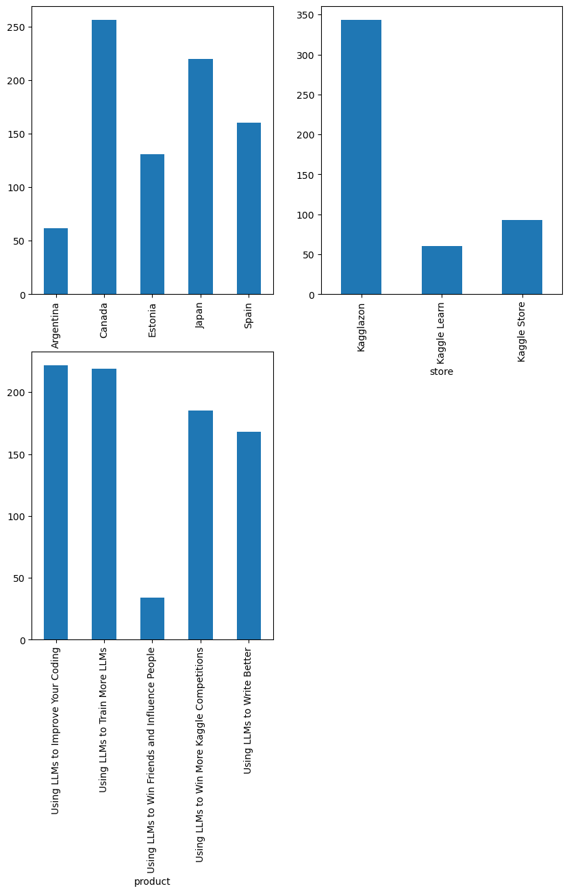
We have some observations from this plot:
Most selling country: Canada
Most visited store: Kagglazon
Most bought products: 'Using LLMs to Improve Your Coding' and 'Using LLMs to Train More LLMs'
Let's find out how does the daily sales look like. We are now interested in overall sales across the world irrespective of the type of product/store/country.
One way to do this is to sum the values num_sold for every date in date which is done using:
daily_sales = df.groupby('date')['num_sold'].sum()
daily_sales
By which, we get:
date
2017-01-01    20086
2017-01-02    15563
2017-01-03    15039
2017-01-04    14516
2017-01-05    14083
              ...
2021-12-27    16724
2021-12-28    18507
2021-12-29    20110
2021-12-30    20156
2021-12-31    20422
Freq: D, Name: num_sold, Length: 1826, dtype: int64
Now then, let's visualize this.
daily_sales.index = daily_sales.index.to_timestamp()

# Plot the daily sales over time
plt.figure(figsize=(15, 5))
plt.plot(daily_sales.index, daily_sales.values, color='0.75')
plt.title('Time plot of daily sales')
plt.xlabel('Date')
plt.ylabel('Daily Sales')
plt.show()
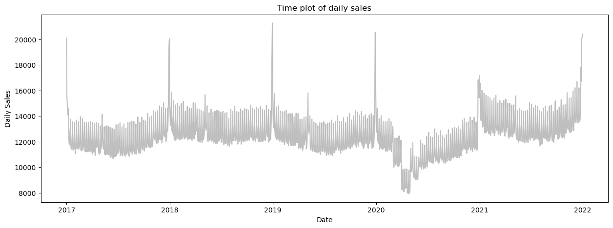
There are a couple of observations we could take away from this:
We can see a yearly seasonality, the sales bump up around the new year (perhaps new-year resolutions XD).
The mid-year sales tend to drop for a while.
The year 2020 has a tremendous drop, perhaps it is the evident COVID-19.
There is a smaller level of seasonality seen.
Can the sales be predicted by sales of the previous day? This can be seen by creating lag features, which make it feel like they have appeared later in time.
# Create a data frame from the previously created daily_sales np array
daily_sales = pd.DataFrame(daily_sales)

# shift the num_sold by 1 day ahead in time
daily_sales['lag_1'] = daily_sales['num_sold'].shift(1)
daily_sales.head()
| num_sold | lag_1 | |
| date | ||
| 2017-01-01 | 20086 | NaN |
| 2017-01-02 | 15563 | 20086.0 |
| 2017-01-03 | 15039 | 15563.0 |
| 2017-01-04 | 14516 | 15039.0 |
| 2017-01-05 | 14083 | 14516.0 |
Now let's plot these 2 columns against each other keeping lag_1 as the x-axis and num_sold as the y-axis.
fig, ax = plt.subplots()
ax.plot(daily_sales['lag_1'], daily_sales['num_sold'], '.', color='0.25')
ax.set(aspect='equal', ylabel='sales', xlabel='lag_1', title='Lag Plot of Average Sales');
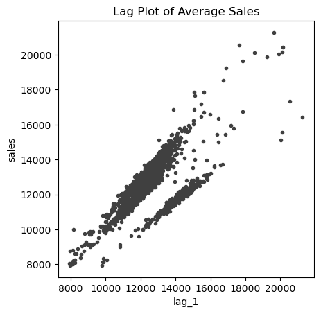
This shows a strong positive correlation with a lag of 1 day. Let's move on to plotting seasonal plots and finding what kind of seasonalities exist in the data. We write a function for a customized plot.
def seasonal_plot(X, y, period, freq, ax=None):
    if ax is None:
        _, ax = plt.subplots()
    palette = sns.color_palette("husl", n_colors=X[period].nunique(),)
    ax = sns.lineplot(
        x=freq,
        y=y,
        hue=period,
        data=X,
        ci=False,
        ax=ax,
        palette=palette,
        legend=False,
    )
    ax.set_title(f"Seasonal Plot ({period}/{freq})")
    for line, name in zip(ax.lines, X[period].unique()):
        y_ = line.get_ydata()[-1]
        ax.annotate(
            name,
            xy=(1, y_),
            xytext=(6, 0),
            color=line.get_color(),
            xycoords=ax.get_yaxis_transform(),
            textcoords="offset points",
            size=14,
            va="center",
        )
    return ax
To check the seasonality in weeks, months and years, we extract these values from the index of daily_sales.
# days within a week
daily_sales["day"] = daily_sales.index.dayofweek  # the x-axis (freq)
daily_sales["week"] = daily_sales.index.week  # the seasonal period (period)
daily_sales['month'] = daily_sales.index.month

# days within a year
daily_sales["dayofyear"] = daily_sales.index.dayofyear
daily_sales["year"] = daily_sales.index.year
Now plotting the graphs:
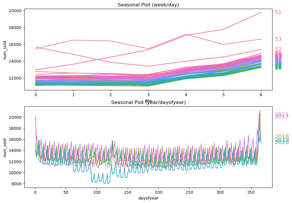
sns.catplot(x='month', y='num_sold', hue='month', data=daily_sales, ci=None, kind='point', palette='husl', height=5, aspect=2)
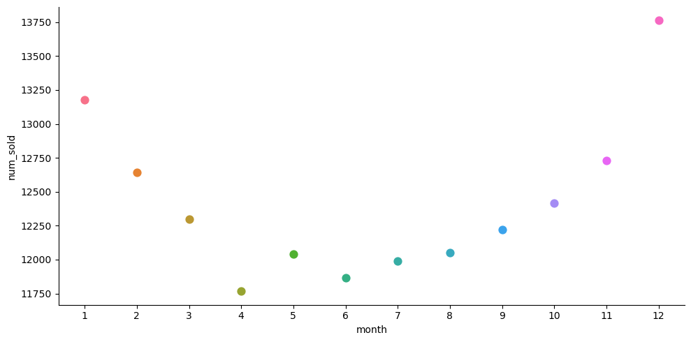
From the above plots, we find that sales are
High on weekends
High around the beginning and end of the year
Let's confirm the seasonalities by plotting a periodogram:
from scipy.signal import periodogram

def plot_periodogram(ts, detrend='linear', ax=None):
    fs = pd.Timedelta(days=365)/pd.Timedelta(days=1)
    frequencies, spectrum = periodogram(ts, fs=fs, detrend=detrend, window='boxcar', scaling='spectrum')
    if ax is None:
        _, ax = plt.subplots()
    plt.figure(figsize=(15,6))
    ax.step(frequencies, spectrum, color='purple')
    ax.set_xscale('log')
    ax.set_xticks([1, 2, 4, 6, 12, 26, 52, 104])
    ax.set_xticklabels(
        [
            "Annual (1)",
            "Semiannual (2)",
            "Quarterly (4)",
            "Bimonthly (6)",
            "Monthly (12)",
            "Biweekly (26)",
            "Weekly (52)",
            "Semiweekly (104)",
        ],
        rotation=30,
    )
    ax.ticklabel_format(axis="y",style="sci",scilimits=(0,0))
    ax.set_ylabel("Variance")
    ax.set_xlabel("Periodogram")
    return ax


plot_periodogram(df['num_sold'].head(27375))
plt.show()
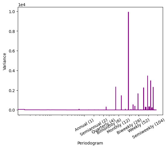
We can now see that the data has strong weekly and monthly seasonality and the monthly frequency is the highest.
With these insights available, we now move on to feature engineering.
Feature Engineering
We found out that features of date like: day of week, day of month, month and year are important features. We extract them using a function.
def parse_date(df):
    df['year'] = df['date'].dt.year.astype('int')
    df['month'] = df['date'].dt.month.astype('int')
    df['day'] = df['date'].dt.day.astype('int')
    df['weekday'] = df['date'].dt.dayofweek.astype('int')
    return df

df = parse_date(df)
df.head()
| id | date | country | store | product | num_sold | year | month | day | weekday | |
| 0 | 0 | 2017-01-01 | Argentina | Kaggle Learn | Using LLMs to Improve Your Coding | 63 | 2017 | 1 | 1 | 6 |
| 1 | 1 | 2017-01-01 | Argentina | Kaggle Learn | Using LLMs to Train More LLMs | 66 | 2017 | 1 | 1 | 6 |
| 2 | 2 | 2017-01-01 | Argentina | Kaggle Learn | Using LLMs to Win Friends and Influence People | 9 | 2017 | 1 | 1 | 6 |
| 3 | 3 | 2017-01-01 | Argentina | Kaggle Learn | Using LLMs to Win More Kaggle Competitions | 59 | 2017 | 1 | 1 | 6 |
| 4 | 4 | 2017-01-01 | Argentina | Kaggle Learn | Using LLMs to Write Better | 49 | 2017 | 1 | 1 | 6 |
Going a step further, determining if a given day is a weekday or not. We can use datetime module for this purpose.
from datetime import datetime

def weekend_or_weekday(year, month, day):
    d = datetime(year, month, day)
    if d.weekday() > 4:
        return 0
    else:
        return 1

df['is_weekday'] = df.apply(lambda x: weekend_or_weekday(x['year'], x['month'], x['day']), axis=1)
df.head()
Let's see if our is_weekday feature is beneficial or not. We do this by calculating the mean of num_sold over weekends and weekdays
df.groupby('is_weekday')['num_sold'].mean()
is_weekday
0    181.313423
1    159.218421
Name: num_sold, dtype: float64
Most sales tend to happen on weekends despite the number of weekends being less in number. This shows that is_weekend is a valuable feature.
Observing our current data frame, we see that we have three columns of type 'object' (string) which is not understandable as a feature by the computer.
df.select_dtypes(include='object').columns.tolist()
['country', 'store', 'product']
We perform one-hot encoding and drop the first column of each of the above columns for better performance.
def encoder_cat(data):
    cat_cols = ['country', 'store', 'product']

    for col in cat_cols:
        temp = pd.get_dummies(data[col], drop_first=True).astype('int')
        data = pd.concat([data, temp], axis=1)
    data.drop(cat_cols, axis=1, inplace=True)
    return data
df = encoder_cat(df)
df.head()
This results in a quite wide data frame.
We now set date as the index.
df = df.set_index('date')
Fourier analysis converts a time series from its original domain to a representation in the frequency domain and vice versa. In simpler words, Fourier Transform measures every possible cycle in time series and returns the overall “cycle recipe” (the amplitude, offset and rotation speed for every cycle that was found).
A deterministic process in time series analysis is a function that describes the systematic components of a time series. This can include things like trends, seasonal patterns, and holidays. Deterministic processes can be used to improve the accuracy of time series forecasting models by removing systematic components from the data.
The statsmodels.tsa.deterministic.DeterministicProcess class in Python provides a way to create and manipulate deterministic processes. This class can be used to create a variety of deterministic processes, including constant terms, linear trends, seasonal dummies, and Fourier terms.
If you feel this overwhelming, it's normal. It'll feel easy once given some time.
We choose 12 terms in the Fourier series, which is done because we saw the strongest seasonality being the monthly one. By order=12 in CalendarFourier() class we achieve the same.
from statsmodels.tsa.deterministic import CalendarFourier, DeterministicProcess

fourier = CalendarFourier(freq='M', order=12)
dp = DeterministicProcess(
    index=df.index,
    constant=False,
    order=1,
    seasonal=False,
    additional_terms=[fourier],
    drop=True
    )
X_time = dp.in_sample()
X_time.head()
Which results in:
| | **
trend** | sin(1,freq=M) | cos(1,freq=M) | sin(2,freq=M) | cos(2,freq=M) | sin(3,freq=M) | cos(3,freq=M) | sin(4,freq=M) | cos(4,freq=M) | sin(5,freq=M) | ... | sin(8,freq=M) | cos(8,freq=M) | sin(9,freq=M) | cos(9,freq=M) | sin(10,freq=M) | cos(10,freq=M) | sin(11,freq=M) | cos(11,freq=M) | sin(12,freq=M) | cos(12,freq=M) | | --- | --- | --- | --- | --- | --- | --- | --- | --- | --- | --- | --- | --- | --- | --- | --- | --- | --- | --- | --- | --- | --- | | date | | | | | | | | | | | | | | | | | | | | | | | 2017-01-01 | 1.0 | 0.0 | 1.0 | 0.0 | 1.0 | 0.0 | 1.0 | 0.0 | 1.0 | 0.0 | ... | 0.0 | 1.0 | 0.0 | 1.0 | 0.0 | 1.0 | 0.0 | 1.0 | 0.0 | 1.0 | | 2017-01-01 | 2.0 | 0.0 | 1.0 | 0.0 | 1.0 | 0.0 | 1.0 | 0.0 | 1.0 | 0.0 | ... | 0.0 | 1.0 | 0.0 | 1.0 | 0.0 | 1.0 | 0.0 | 1.0 | 0.0 | 1.0 | | 2017-01-01 | 3.0 | 0.0 | 1.0 | 0.0 | 1.0 | 0.0 | 1.0 | 0.0 | 1.0 | 0.0 | ... | 0.0 | 1.0 | 0.0 | 1.0 | 0.0 | 1.0 | 0.0 | 1.0 | 0.0 | 1.0 | | 2017-01-01 | 4.0 | 0.0 | 1.0 | 0.0 | 1.0 | 0.0 | 1.0 | 0.0 | 1.0 | 0.0 | ... | 0.0 | 1.0 | 0.0 | 1.0 | 0.0 | 1.0 | 0.0 | 1.0 | 0.0 | 1.0 | | 2017-01-01 | 5.0 | 0.0 | 1.0 | 0.0 | 1.0 | 0.0 | 1.0 | 0.0 | 1.0 | 0.0 | ... | 0.0 | 1.0 | 0.0 | 1.0 | 0.0 | 1.0 | 0.0 | 1.0 | 0.0 | 1.0 |
Congratulations! You've engineered such valuable features so far! Now, we move on to developing models.
Model Developments and Predictions
Creating a Hybrid Model
Time series consists of 4 major components:
Trend: A long-term upward or downward movement in the mean of data, indicating a general increase or decrease over time.
Seasonality: A repeating pattern in the data that occurs at regular intervals, such as daily, weekly, monthly, or yearly.
Cycles: A longer-term pattern in the data that occurs over periods of several years.
Error: Random fluctuations in the data that cannot be attributed to any of the other components.
Which basically means, "series = trend + seasons + cycles + error"
Linear models are very good at capturing the trend component. But they are very sceptical about adjusting to other aspects. The remaining components can be learnt better by algorithms like DecisionTrees, RandomForests and Gradient Boosted Decision Trees (XGBoost).
To combine the strengths of these 2 types of algorithms, we can first train the model with LinearRegression() on X_time fourier features then use the 2nd type of algorithms like RandomForest() / XGBoost() and train on the remaining features i.e df.
# Target series
y = df.loc[:, 'num_sold']

# X_1: Features for Linear Regression
X_1 = X_time

# X_2: Features for XGBoost
X_2 = df.drop('num_sold', axis=1)
Creating a class to make things easier,
class BoostedHybrid:
    def __init__(self, model_1, model_2):
        self.model_1 = model_1
        self.model_2 = model_2
        self.y_columns = None  # store column names from fit method

def fit(self, X_1, X_2, y):
    # YOUR CODE HERE: fit self.model_1
    self.model_1.fit(X_1,y)

    y_fit = pd.Series(
        # YOUR CODE HERE: make predictions with self.model_1
        self.model_1.predict(X_1),
        index=X_1.index, name=y.name,
    )

    # YOUR CODE HERE: compute residuals
    y_resid = y - y_fit

    # YOUR CODE HERE: fit self.model_2 on residuals
    self.model_2.fit(X_2, y_resid)

    # Save column names for predict method
    self.y_columns = [y.name]
    # Save data for question checking
    self.y_fit = y_fit
    self.y_resid = y_resid


# Add method to class
BoostedHybrid.fit = fit


def predict(self, X_1, X_2):
    y_pred = pd.Series(
        # predict with self.model_1
        self.model_1.predict(X_1),
        index=X_1.index, name='prediction',
    )

    # add self.model_2 predictions to y_pred
    y_pred += self.model_2.predict(X_2)

    return y_pred


# Add method to class
BoostedHybrid.predict = predict
Creating training and testing sets.
from sklearn.model_selection import train_test_split

X1_train, X1_val, y_train, y_val = train_test_split(X_1, y,random_state=42,test_size=0.2)
X2_train, X2_val, y_train, y_val = train_test_split(X_2, y,random_state=42,test_size=0.2)
All that is left for us now is to train the models using different combinations of linear and tree algorithms. Some options that you can try are:
Linear Regression: ElasticNet, Lasso, Ridge
Tree algorithms: ExtraTreesRegressor, RandomForestRegressor, KNeighborsRegressor
Feel free to experiment with any of these combinations. For this tutorial, we go with LinearRegression( ) along with XGBoost()
import xgboost as xgb
from sklearn.linear_model import LinearRegression

model = BoostedHybrid(LinearRegression(), xgb.XGBRegressor())
model.fit(X1_train, X2_train, y_train)

y_pred = model.predict(X1_val, X2_val).clip(0.0)
The competition was evaluated on SMAPE (Symmetric Mean Absolute Percentage Error) which has the formula:
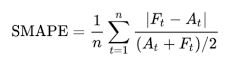
Where A_t stands for the actual value, while F_t is the forecasted value. We now write a function to facilitate this formula and return it as a percentage. A lower percentage means better prediction.
def smape(y_true, y_pred):
    y_true = np.array(y_true)
    y_pred = np.array(y_pred)
    numerator = np.abs(y_true - y_pred)
    denominator = np.abs(y_true) + np.abs(y_pred)
    smape_score = np.mean(2 * numerator / denominator) * 100
    return smape_score
Trying it out:
smape(y_val,y_pred)
11.005934096648064 # Look's okay, but can't say anything unless we try other options
Try training models with other possible combinations of algorithms. Then see which among those gives the best results.
A bonus feature (assignment)
Try including a time-step feature, which means a serially ordered number for every consecutive date. These would be beneficial because we found lag features had a good positive correlation. Also, remove the id column as it is just a serial number. See if this part acts as an improvement.
If you wish to try your models on test.csv, repeat the same feature transformations as above and submit them as per the format of sample_submission.csv. This is a good way to check the performance of your model.
Alright! From importing a CSV file to predicting sales, we came a long way! I hope this post provided value to your time. I would appreciate reading your views on it.
Thanks for sticking so far. Happy learning :)